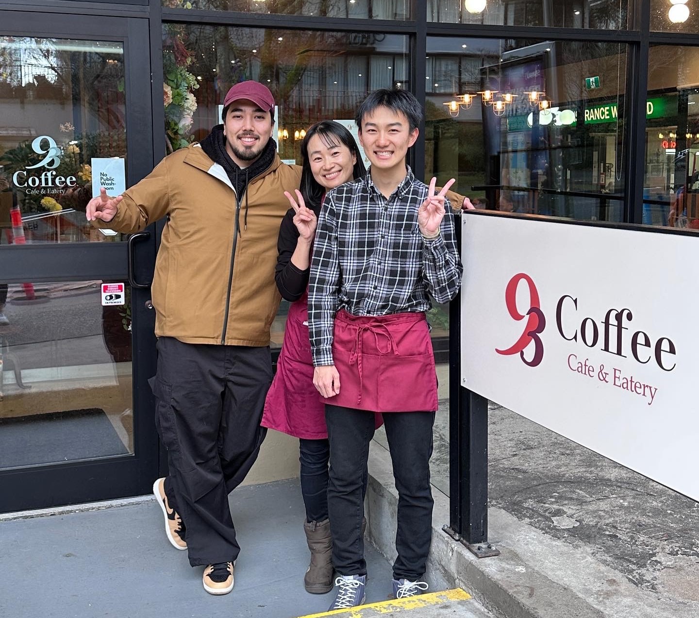
Partnering with 93 Coffee Cafe & Eatery in Vancouver was an exciting journey. Over a few months, I crafted their logo and visual identity, capturing the essence of their cozy cafe vibe. Additionally, I had the pleasure of photographing their delicious food and drinks, setting the stage for their online presence. It was a rewarding experience to play a part in bringing this new cafe to life in Vancouver’s bustling cafe scene.
Japanese Kissaten
Before embarking on creating their brand, it was vital to understand 93 Coffee Cafe & Eatery’s vision, they wanted to evoke the warm and welcoming atmosphere of a Japanese-style cafe, known as a kissaten. To capture this essence, I delved into research, exploring branding and design elements from similar cafes. By immersing myself in this world, I gained insights into the cozy ambiance and unique aesthetic of kissaten cafes, which guided the direction of our logo design and branding. This research-driven approach ensured that every aspect of 93 Coffee’s brand reflected the inviting and authentic feel of a traditional kissaten.
The Logo
Initially, the design direction for 93 Coffee Cafe & Eatery’s logo was heavily influenced by the preferences of the owner/client. They expressed a desire for a traditional cafe logo with ornamental and flowery elements, which I embraced wholeheartedly. However, upon seeing renderings of their cafe space, I realized that the initially planned branding wouldn’t align with the physical environment.
The cafe’s bright, open-concept space with minimal decor and a post-modern aesthetic called for a more modern and simplified logo design. This realization prompted a significant shift in the design approach towards a sleeker and more contemporary look, which resonated well with the clients.
Creating The Brand
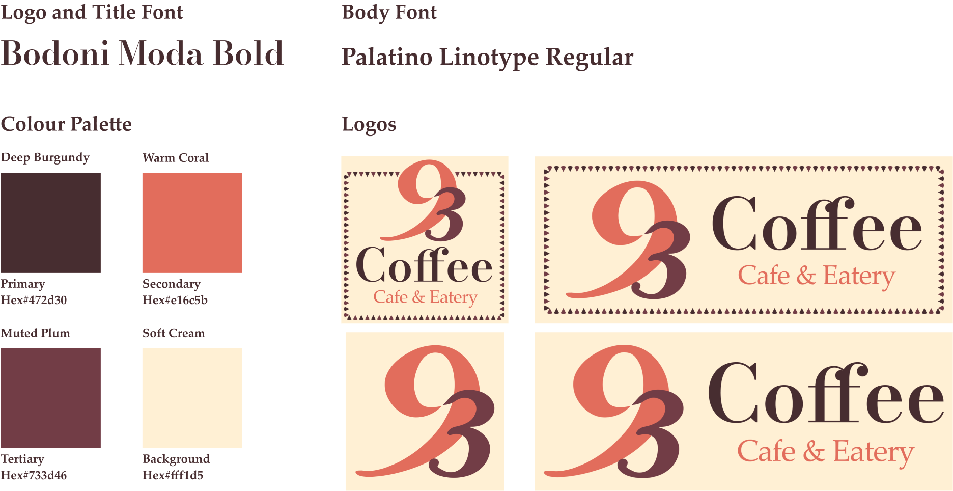
The color palette for 93 Coffee Cafe & Eatery’s branding was changed to evoke a sense of warmth and sophistication. The primary color, a deep burgundy, exudes a rich and inviting tone, while the secondary color, a warm coral, adds a touch of vibrancy and energy. The tertiary color, a muted plum, complements the primary and secondary hues with its deep and earthy undertones. Against the background of a soft cream, these colors harmonize to create a cozy and welcoming ambiance reflective of the cafe’s atmosphere.
For the logo, the Bodoni Moda Bold font was chosen for its timeless elegance and refined aesthetic, capturing the essence of the cafe’s modern yet sophisticated vibe. Additionally, the branding element—a line pattern of crepe-shaped cones used as a border—adds a playful and whimsical touch, paying homage to the cafe’s culinary offerings and enhancing the overall visual identity.
Photo Shoot
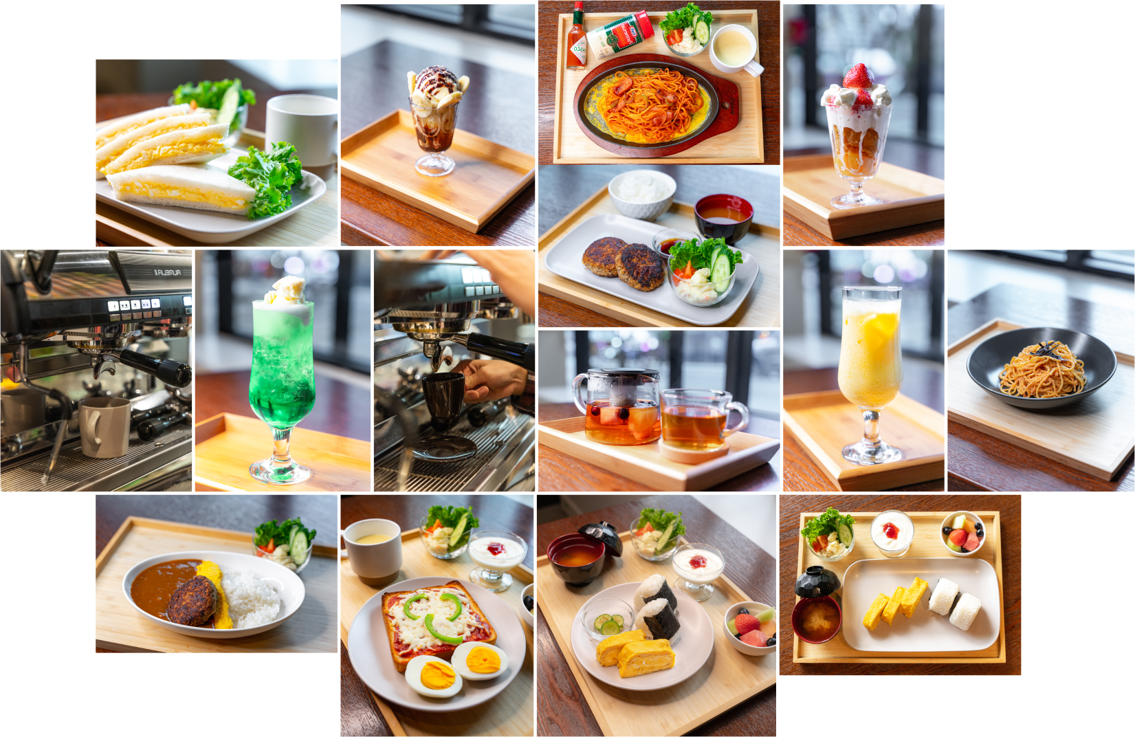
In order to help kickstart their digital presence, I organized and took photos of their food so they could use them in both future menus and social media posts.
My Other Projects
CASE STUDY - EXPERIENCE DESIGN STUDENT PROJECT
Formula E - ZONE
An onboarding experience that takes you on a thrilling journey through the racing mechanics and cutting-edge technologies that make Formula E the most electrifying racing series around.
Working with Goodself, our team conducted user studies and data collection methods to evaluate two onboarding processes. Our aim was to help Goodself optimize their onboarding strategies for better user engagement.