KAI VON DEHN DOMINIQUE SURAYA ARITRO MUKHOPADHYAY SOHEILA BOSCARINO CELIA GU
Onboarding Experience
Over four weeks, we leveraged varying research and Experience Design methods to swiftly tackle a business problem and generate a valuable solution for Formula E and their fans.
Through our efforts, our team landed on adding an onboarding experience for the Formula E mobile site, offering an efficient way to introduce new young fans to the mechanics of the world’s most electrifying motorsport.
My Responsibilities
Researcher and Copywriter
As a Researcher, I played a crucial role in designing surveys and interviews, analyzing collected data, and extracting valuable insights.
As a copywriter, I created clear and concise copy to communicate our weekly progress and iterations to our classmates and teaching staff.
For the final versions of the prototype, I utilized a combination of Figma prototyping and Adobe After Effects to create engaging video mockups.
I also want to note that our team operated collaboratively, with each member seamlessly contributing to different aspects of the project.
In the initial weeks of our project, we quickly explored the world of Formula E. Understanding the intricacies of this unique motorsport was crucial to inform our decision-making process and generating quick solutions.
Our team thoroughly researched and uncovered various aspects of the Formula E brand, including its core concept, value pillars, business strategy, attributes, stakeholders, and touchpoints.
Formula E Brand Pillars
Small Sample of Reddit Posts Expressing Confusion
Articles Critiquing Formula E's Brand Identity
Gaining Community Insights
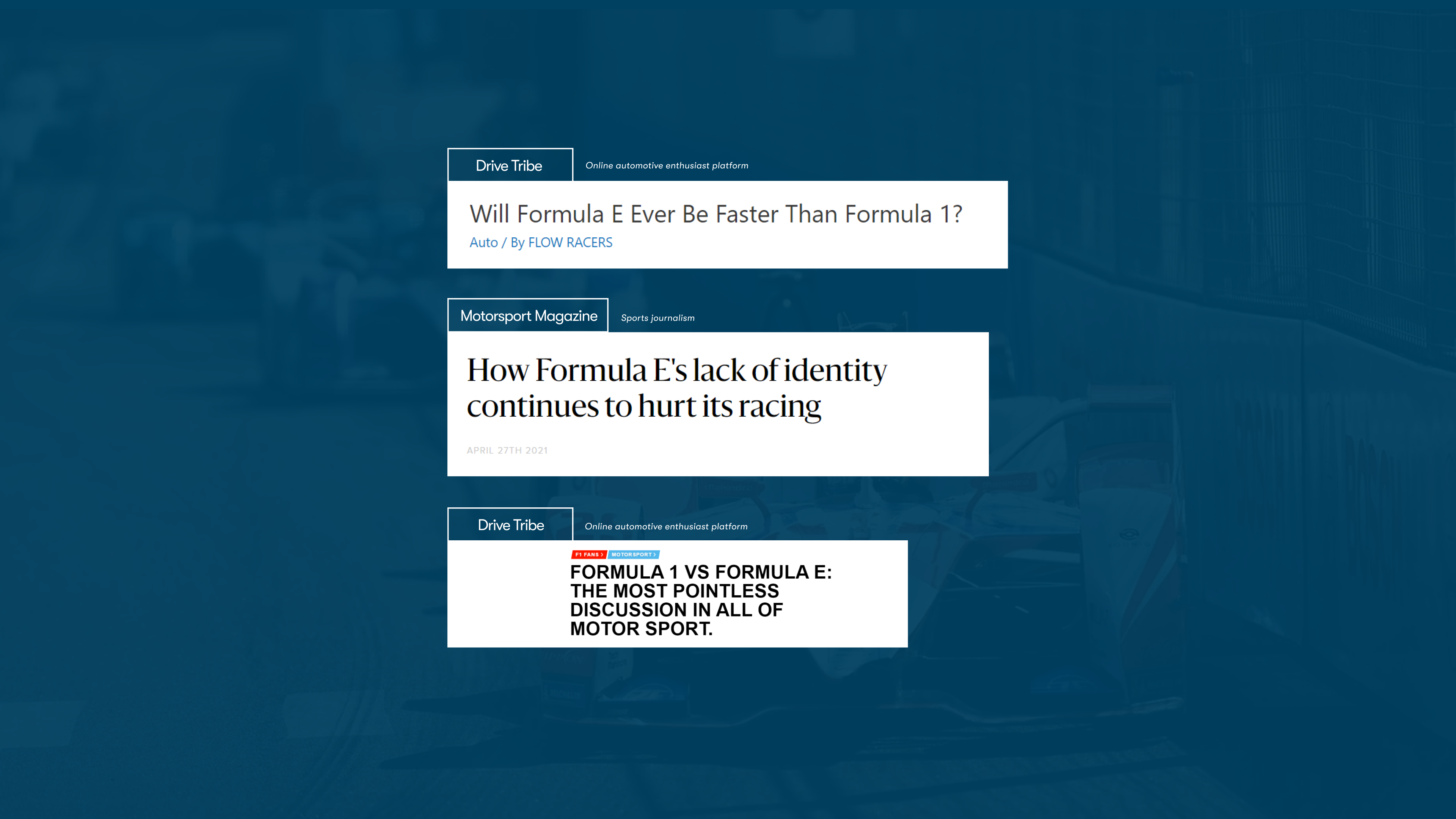
We started by observing official Formula E races on YouTube to experience the dynamic motorsport environment ourselves. It was a fun but very confusing watch.
We also scoured social media platforms such as Reddit and Twitter to get an initial insight into how the online community felt about this electric motorsport and found many comments similar to our own experience and overall frustration with the official website of Formula E.
Furthermore, we found multiple articles criticizing the new Electric Grand Prix for their lack of brand identity and constant comparison to their gas counterpart F1.
Narrowing Our Research Focus
The team initially contemplated a complete redevelopment of the Formula E brand. However, we recognized the project’s scope was outside our timeline and realized the potential value in addressing the existing issues with their website instead.
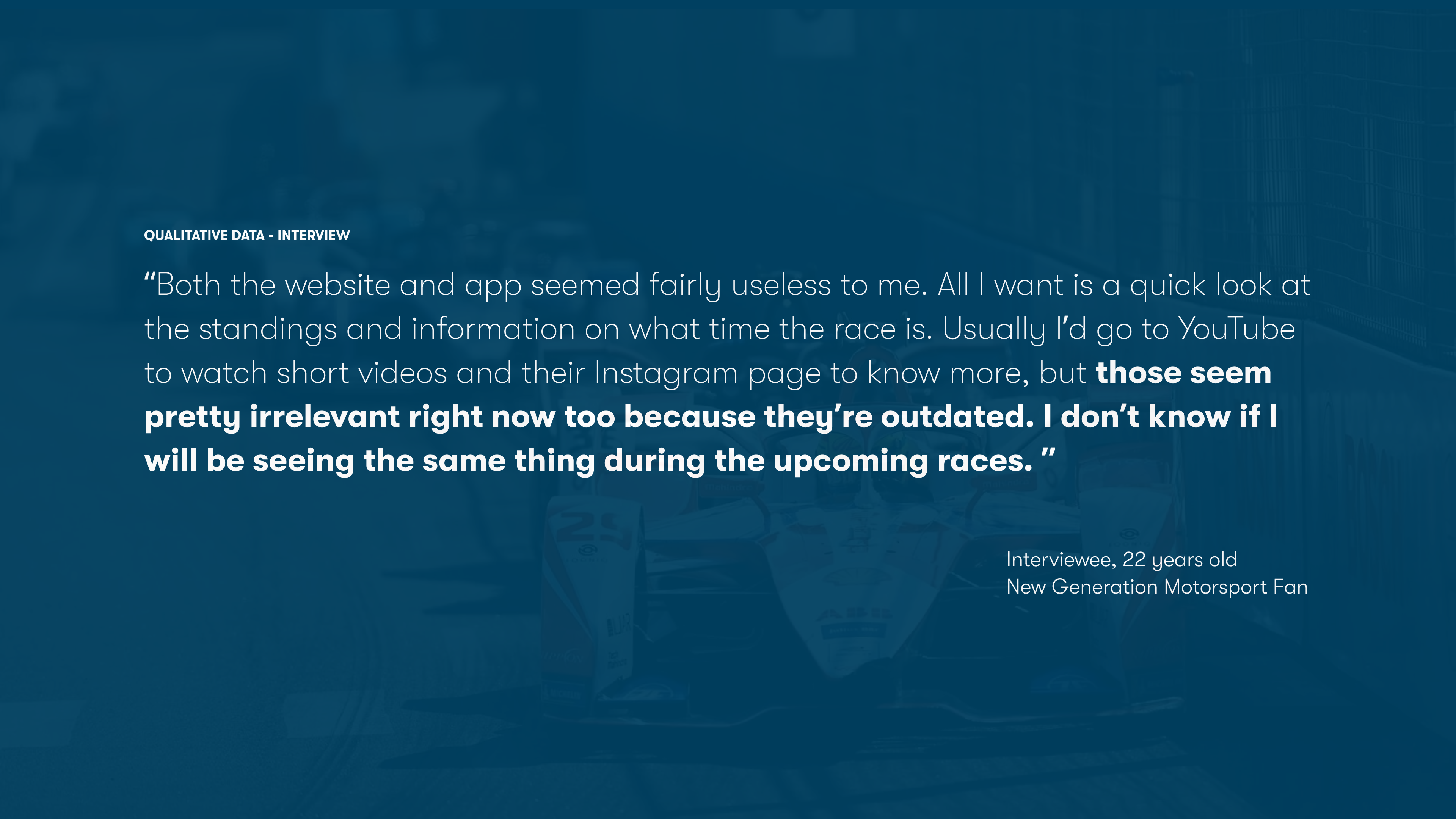
We conducted targeted interviews and surveys to narrow our research focus and obtain specific insights regarding the Formula E website.
Key Quote From Our Interviews
Survey Takeaways
Landing The Problem
Finally, after endless hours of research, our team decided on a business problem, a “How Might We” statement and a potential intervention we would use to Ideate, Prototype, Test, and Iterate on for the next few weeks.
The Design Process
The Business Problem
New viewers of Formula E are overwhelmed by the cognitive overhead of the unique gamified race mechanics like “Attack Mode” and “Fan Boost,” and their lack of knowledge about the teams and drivers makes the overall experience confusing and intimidating.
How Might We
How might we showcase and surface the competitive nature of Formula E to new viewers to create long-lasting brand engagement?
Potential Intervention
Our team proposed the development of a dedicated microsite for Formula E, independent from their main website. This service would utilize cookies to identify first-time visitors and offer a prompt to navigate them to our microsite for an enhanced user experience.
It would be difficult to convince new fans to visit our microsite when the original website is confusing enough as it is.
All this new content that our team was creating was derived from existing content which would be redundant and only confuse new fans.
Our target audience was also not specific enough to give us a clear goal of what the intervention would provide.
Shifting Our Focus
After getting feedback, we decided to recontextualize existing Formula E content directly into the official Formula E website as an onboarding experience.
This decision would directly tackle the business problem of high cognitive overhead, and narrowing our target audience to Gen Z motorsport fans allowed us to refine our approach.
Landing Our Project
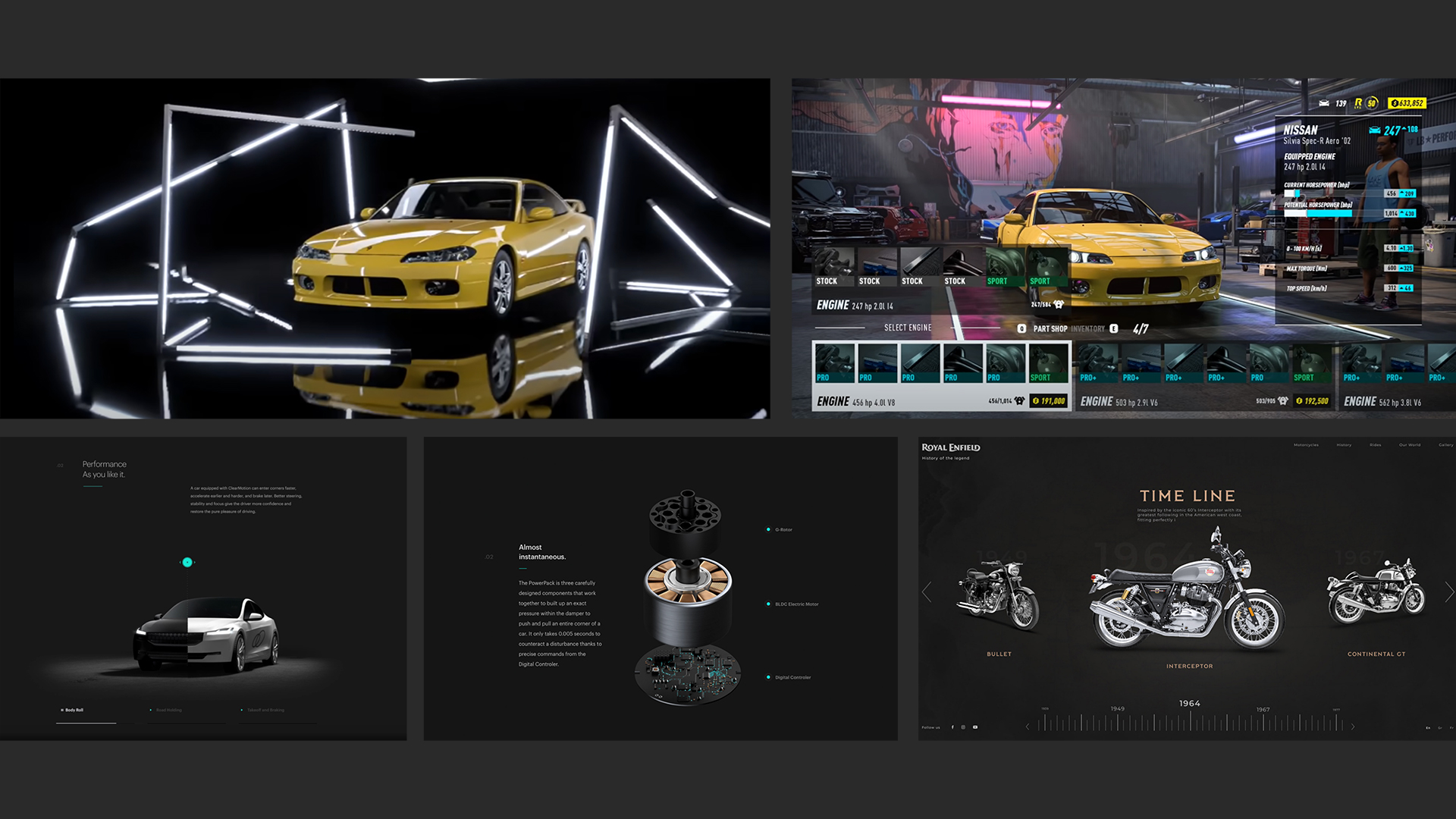
This shift influenced our final intervention design choices, emphasizing short-form videos and prioritizing a mobile version.
By tailoring our solution to meet the preferences and habits of our target audience, we effectively created an onboarding experience that resonates with the next generation of motorsport enthusiasts.
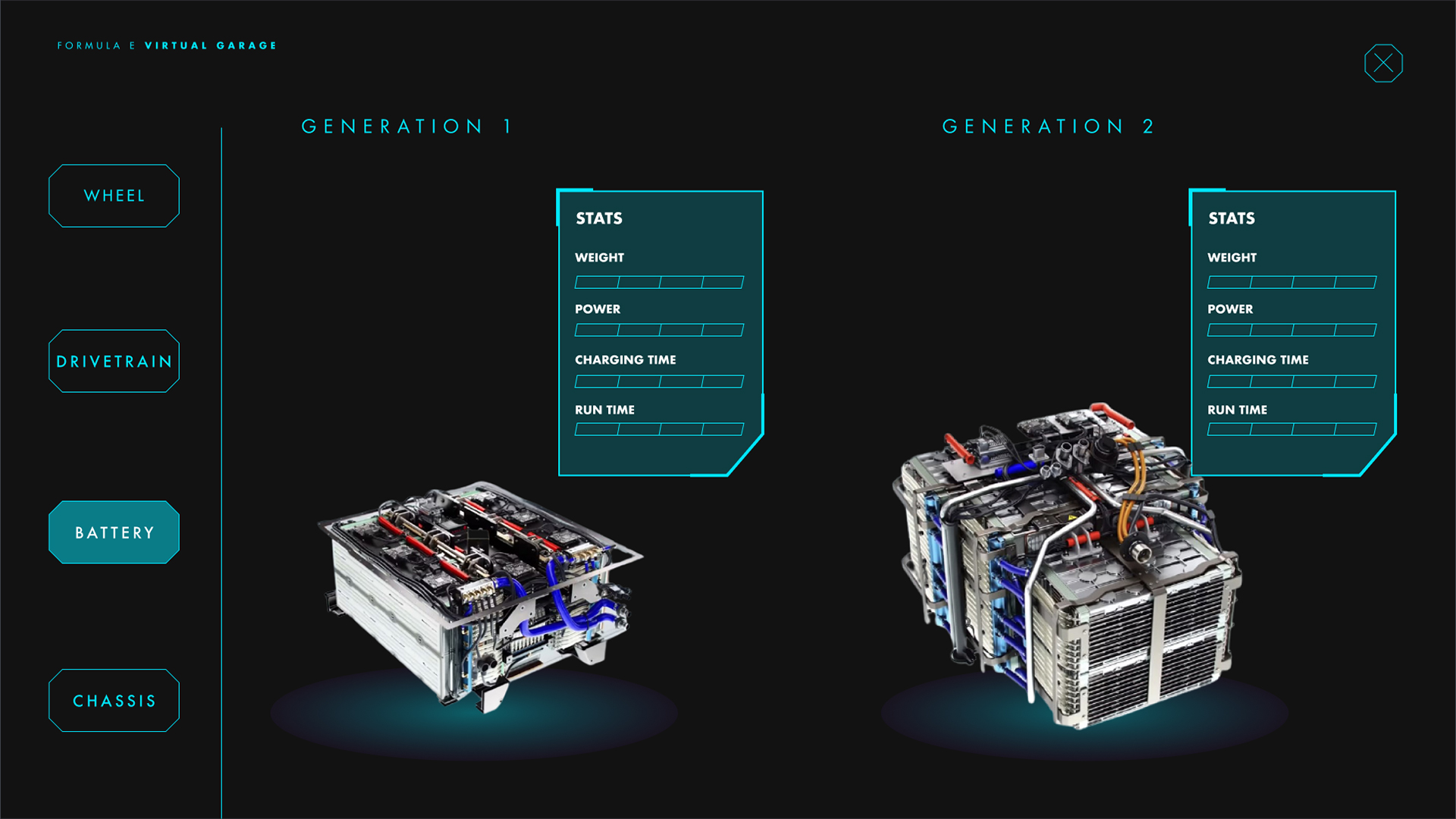
Final Prototype
Landing on the Site
First time visitors of the current Formula E website are overwhelmed with the wall of information creating a gap between the business and the customer.
Our solution is to reduce this cognitive overhead by presenting Formula E in an immersive and digestible way.
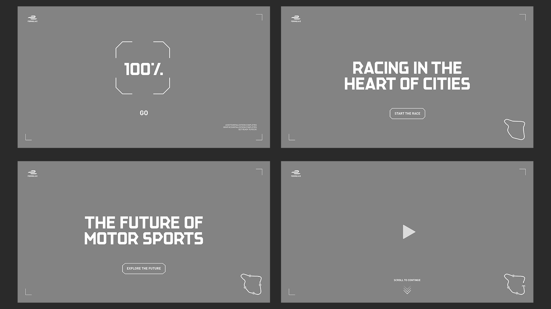
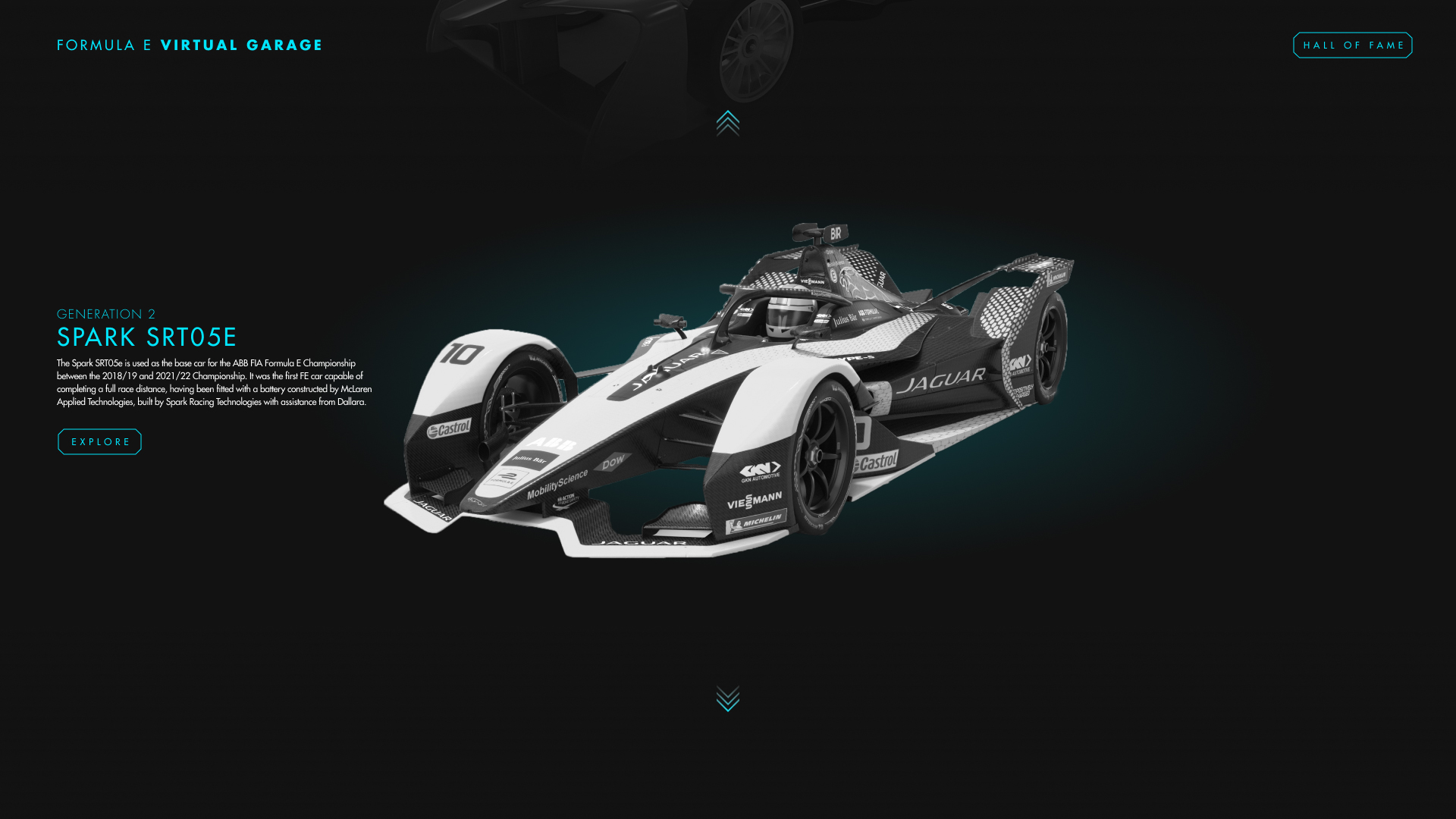
Mobile Onboarding
Discoverability is now accessible for new Formula E fans.
Using cookies, the Formula E website determines if the site visitor is a first-time viewer, directing them to our newly designed onboarding intervention.
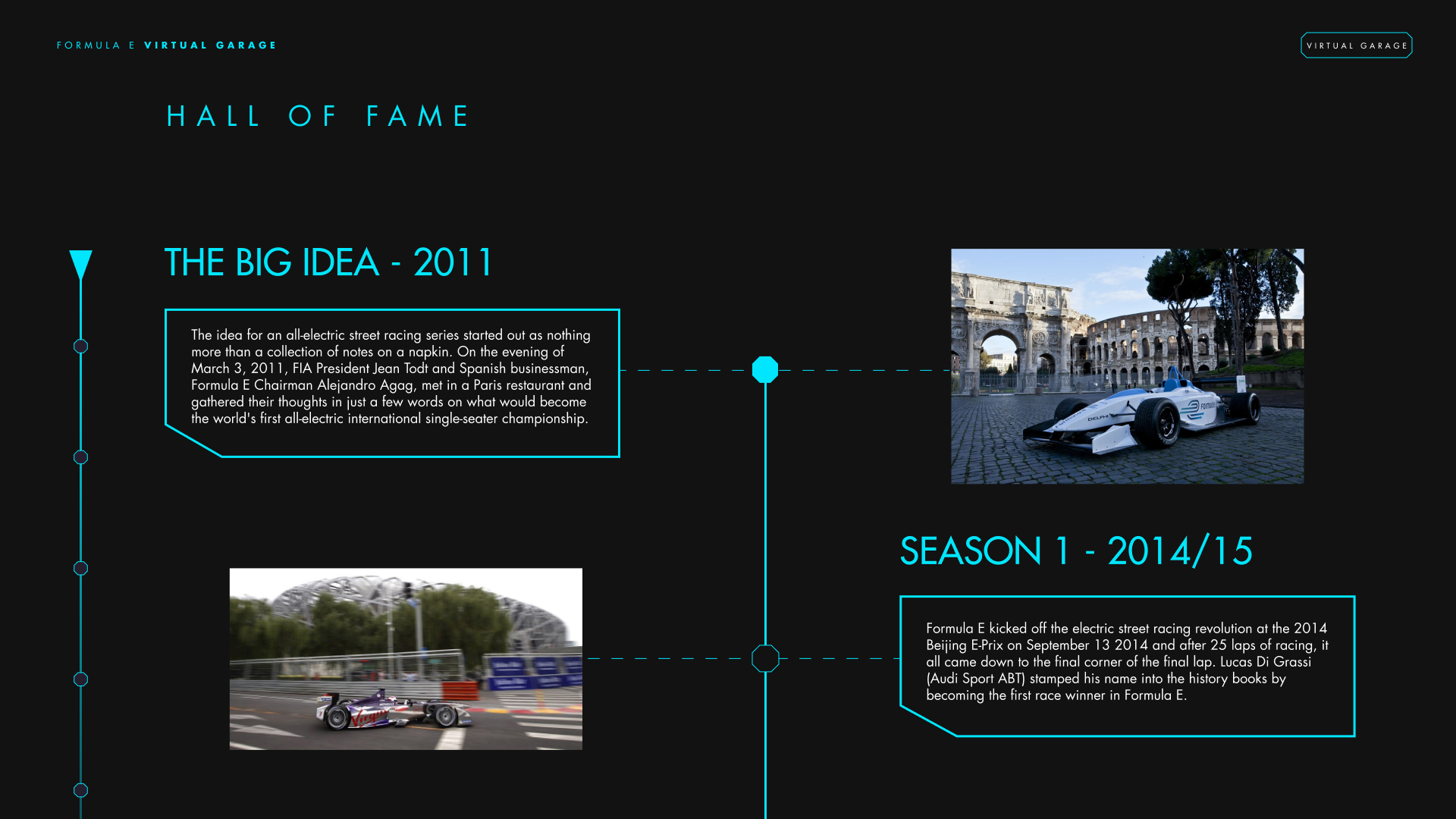
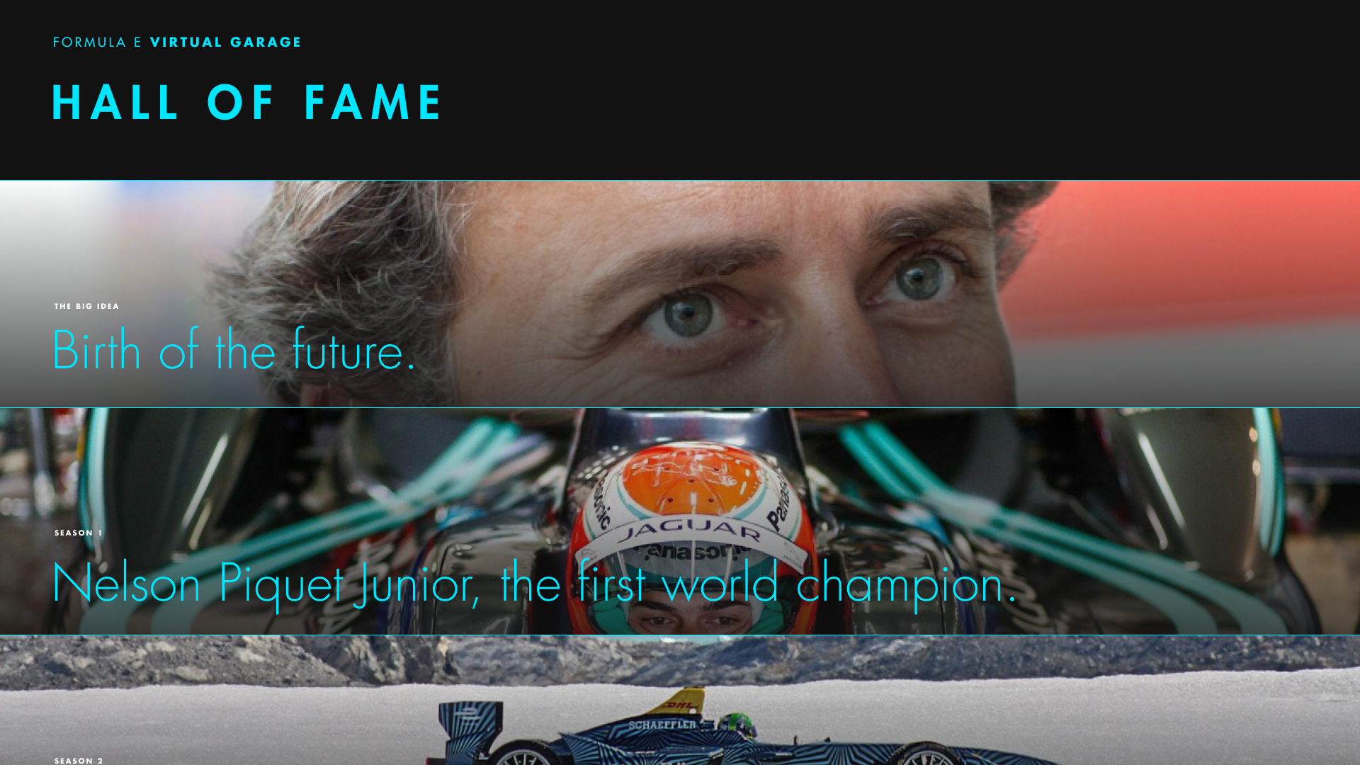
New potential fans are welcomed with an exhilarating onboarding experience that utilizes existing Formula E content and recontextualizes them into short-form interactive videos inspired by the popular social media app TikTok.
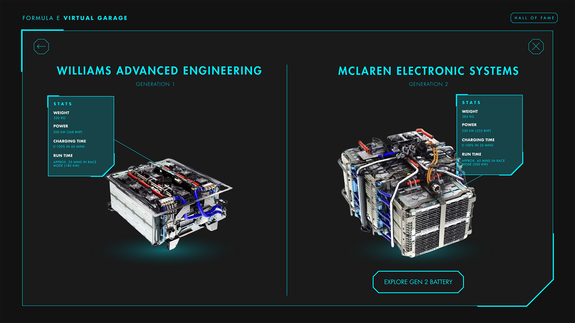
Understanding Race Mechanics
Interactive hotspots were strategically placed throughout the videos to further explain race jargon and reinforce their meaning while keeping viewers engaged with the experience.
Scrubbing and Progress Bar
We incorporated scrubbing functionality, enabling users to flexibly skip sections and navigate the content. Additionally, interactive hotspots were strategically placed as grey points to ensure viewers did not miss essential information.
To enhance user experience, a progress bar was implemented on the left side, providing constant visibility of their progress throughout the onboarding process, emphasizing that the experience has a clear endpoint.
Experience for Yourself
(play with sound)
CASE STUDY - BRANDING & LOGO DESIGN
93 Coffee
Partnering with 93 Coffee Cafe & Eatery in Vancouver was an exciting journey. Over a few months, I crafted their logo and visual identity, capturing the essence of their cozy cafe vibe. Additionally, I had the pleasure of photographing their delicious food and drinks, setting the stage for their online presence.
Working with Goodself, our team conducted user studies and data collection methods to evaluate two onboarding processes. Our aim was to help Goodself optimize their onboarding strategies for better user engagement.