Kvondehn
GoodSelf
UX Research & Design Evaluation
10 Minute Read
THE TEAM
KAI VON DEHN
SHIRLEY LIANG
EUGENE ZHU
CRYSTAL WEI
ALEX KING
Working with Goodself
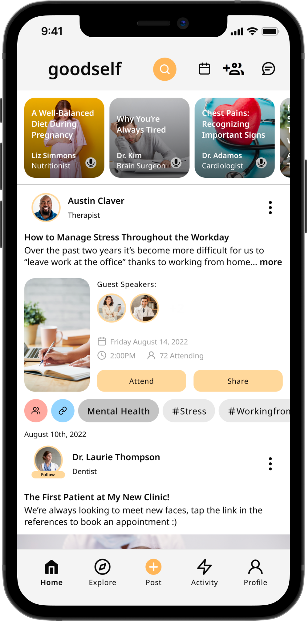
Goodself is a health-based social media app designed to provide users with a platform to connect with like-minded individuals, share health-related information and resources, and track their wellness journey. As a startup, Goodself lacks a research team to evaluate its existing designs and sought our team’s expertise in assessing the onboarding process for its platform.
My Responsibilities
Team Lead & UX Researcher/Writer
As team lead, UX Researcher, and Writer, I orchestrated team meetings, guided discussions, and mapped out a project timeline to ensure our objectives were met. My responsibilities encompassed crafting questionnaires, orchestrating studies, and supervising our affinity diagramming sessions. Moreover, I spearheaded the majority of recommendations and oversaw the creation, editing, and direction of the final report and content strategy for presentations.
Throughout the project, I navigated challenges stemming from unmotivated team members who contributed minimally despite encouragement. In response, I employed my leadership and resource management skills to optimize each team member’s potential and propel the project to fruition.
Goodself’s Goal
Our collaboration with Goodself centered on two primary objectives: attracting more users aged 18-30 and refining their sign-up process for enhanced ease of use. Acknowledging the shortcomings in their existing system, Goodself sought to modernize it to align with contemporary social media standards, prioritizing a seamless onboarding experience for users.
Presented with two distinct sign-up processes, our task was to select the one poised to attract a greater influx of new users while ensuring simplicity and enjoyment, ultimately fostering user engagement and retention.
Our Intervention
After analyzing Goodself’s goals, our team shifted the focus. Rather than choosing one design over the other, which could lead to inefficiencies, the team decided to extract the most effective elements from both designs and amalgamate them to create a set of mockups.
By blending these elements, we aimed to optimize the onboarding experience, ensuring that it surpassed the limitations of individual designs and aligned perfectly with the client’s goals. To ensure the success of our approach, thorough testing of both designs was essential.
The Methods
To evaluate the onboarding designs for Goodself, our team employed a combination of heuristic evaluations and user studies.
Heuristic Evaluation
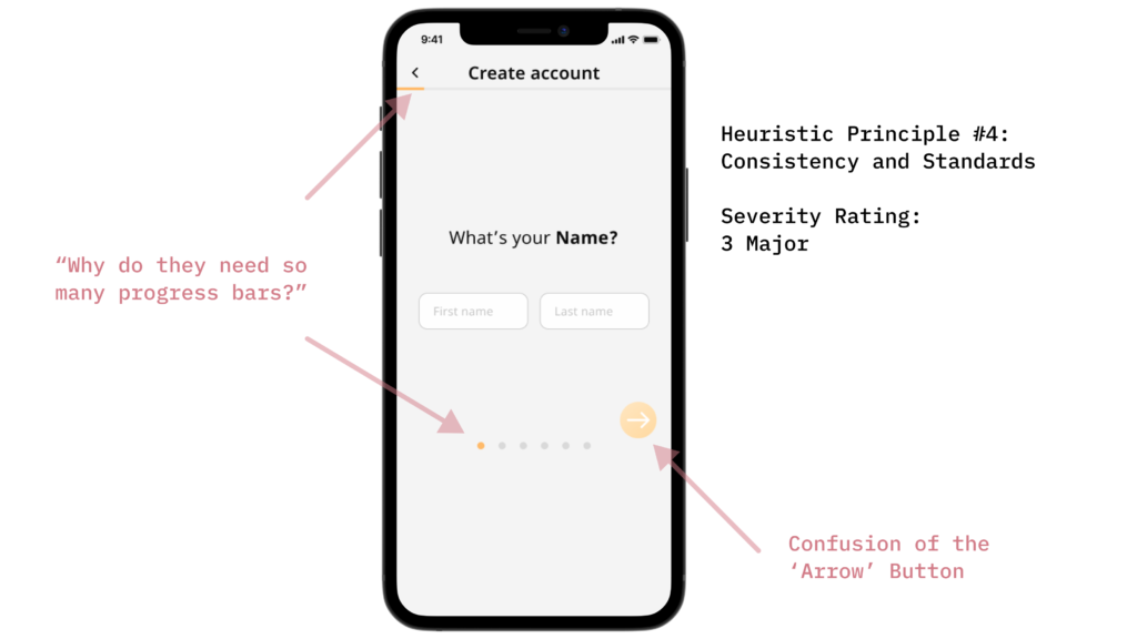
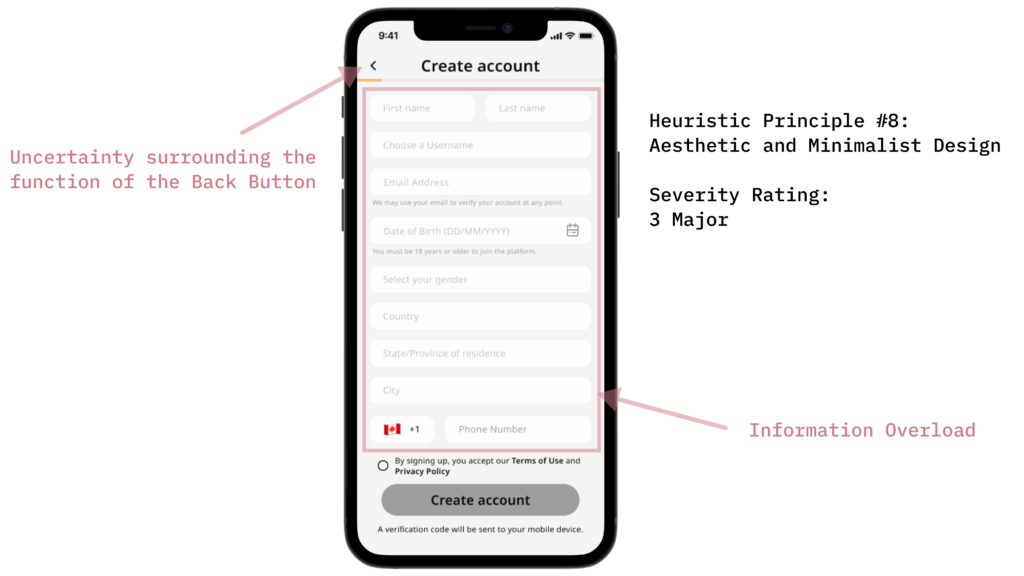
We employed Nielsen Norman Group’s ten usability heuristics to evaluate both old and new designs, enabling swift and systematic issue identification. Each of our five designers individually rated issues discovered on a severity scale of 1 to 4. Subsequently, we collectively reviewed and discussed the 20 identified issues, serving as a reference point for our usability study outcomes and subsequent recommendations.
User Studies
For our usability study, we recruited 10 participants aged 18 to 25, all showing a fundamental interest in health and wellness with some experience using social media apps.
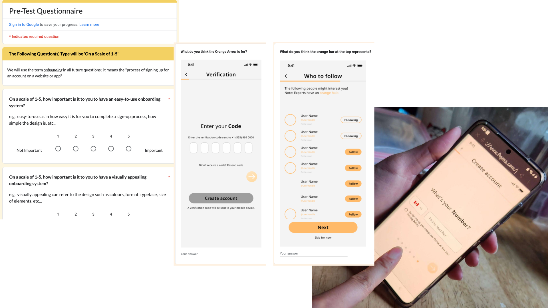
Using a pre-test questionnaire, we gathered qualitative insights, revealing participants’ desire for a visually appealing and user-friendly onboarding experience. The study was conducted in person in a home setting to replicate real-life scenarios.
We then conducted conceptual model extractions, presenting participants with screenshots of Prototype A and B and collecting their feedback through specific questions. Then using the think-aloud method, participants verbally expressed their thoughts and emotions while completing tasks on both prototypes, yielding rich data on their perceptions and pain points.
We concluded with a post-test questionnaire and interview, combining Likert-scale questions with open-ended inquiries to gain comprehensive insights into participants’ experiences with the prototypes. Despite limitations in prototype interactivity, our methodology provided a wide-range of valuable data on user perceptions and preferences.
Data Analysis
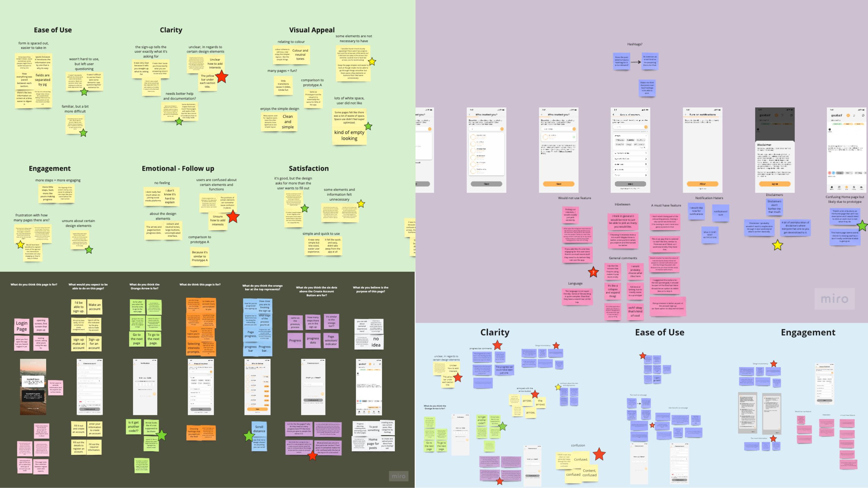
To analyze our data comprehensively, we employed affinity diagramming to categorize similar comments across various sources: conceptual model extraction, think-aloud sessions, and interview responses. Following this grouping process, we assessed the severity of identified issues on a scale ranging from low to high priority. Subsequently, we clustered the most critical issues into three key constructs: clarity, ease of use, and engagement.
Lastly, we cross-referenced the identified pain points with the results of our heuristic evaluation. This comparison allowed us to identify overlaps and discrepancies, providing valuable insights into the specific areas of the designs requiring improvement. These findings empowered our team to propose actionable recommendations aimed at enhancing the usability and user experience of the Goodself platform.
Results and Issues
Due to the limitations of time, we focused on three major issues within the prototypes and provided reccomendations with mockups to help direct the future of the onboarding system for Goodself.
Engagement
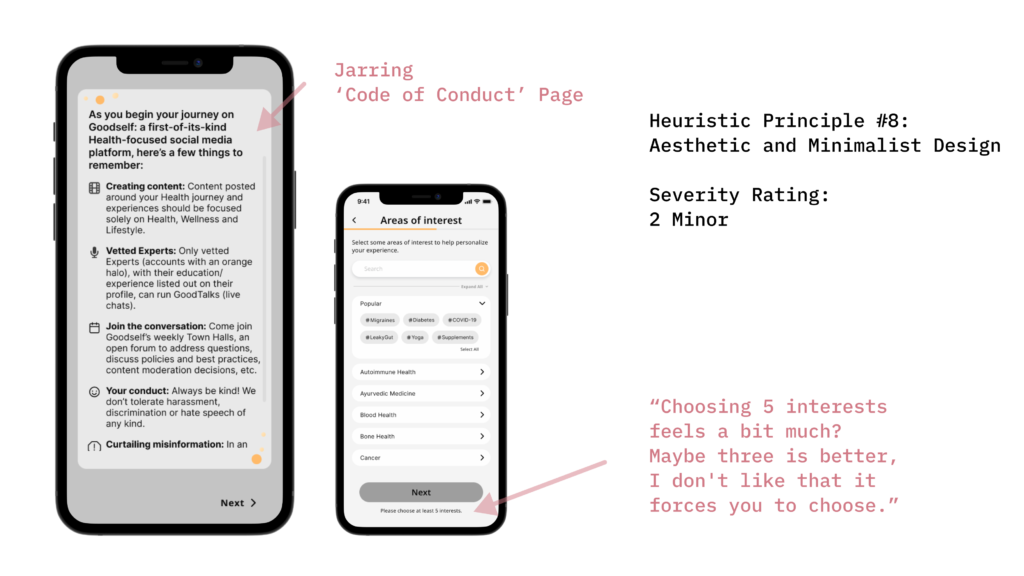
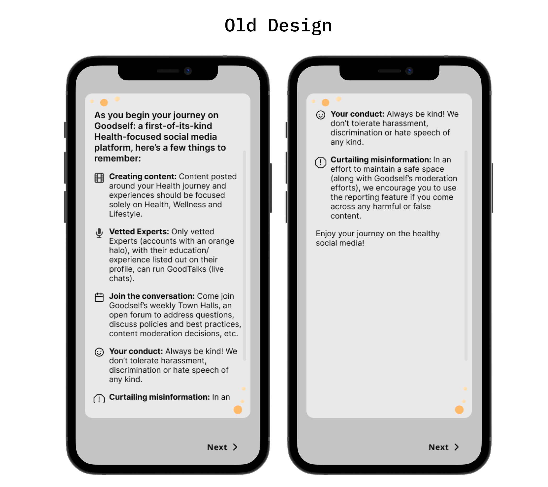
Within the engagement construct, participants identified the code of conduct page as disruptive due to information overload and a departure from the overall visual consistency. Additionally, opinions regarding the mandatory selection of interests varied among participants, highlighting the need for further exploration to strike a balance between user engagement and functionality.
Redesign Proposals
Using the data that was analyzed in the affinity diagraming and the heuristic evaluation, our team made informed decisions on recommendations that Goodself should implement in their future design of the onboarding experience.
Proposal 1: Redesign of Form Page
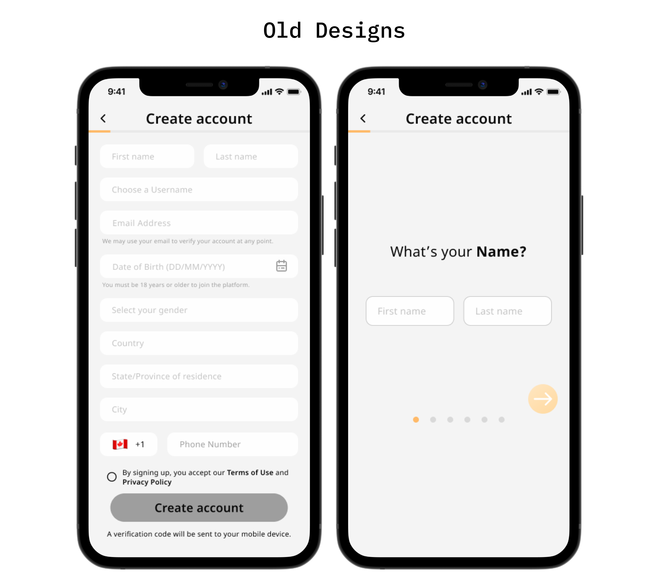
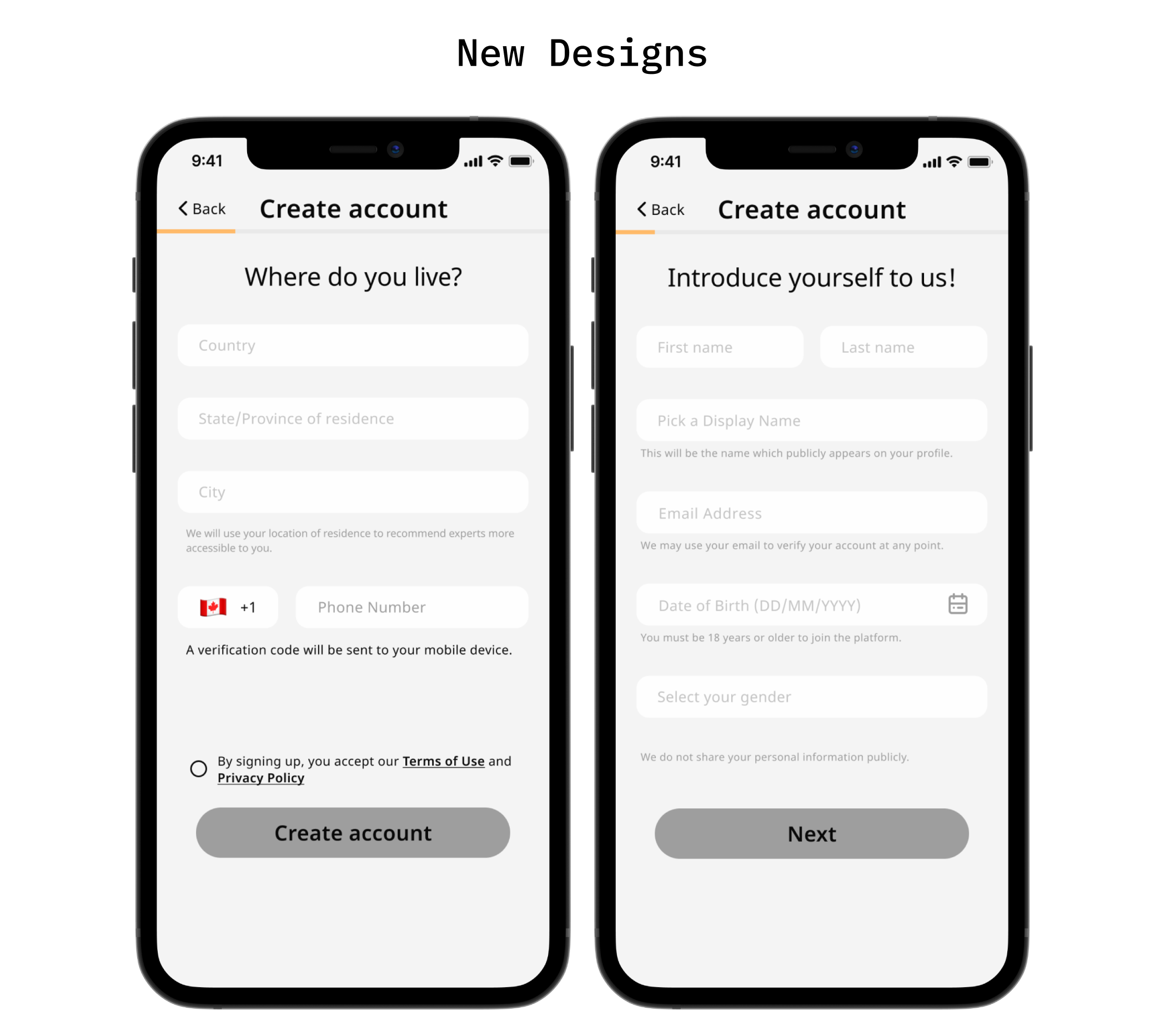
Splitting the form into two pages addresses user concerns about overwhelming content while grouping similar fields together. Additionally, removing unnecessary elements such as the second progress dots and orange arrow button ensures consistency across the onboarding experience.
Adjustments to wording on fields and the addition of subtext aims to clarify user expectations, while explicit labeling of the back button reduces uncertainty. This redesign will streamline the onboarding process and improve user comprehension.
Proposal 2: Recontextualization
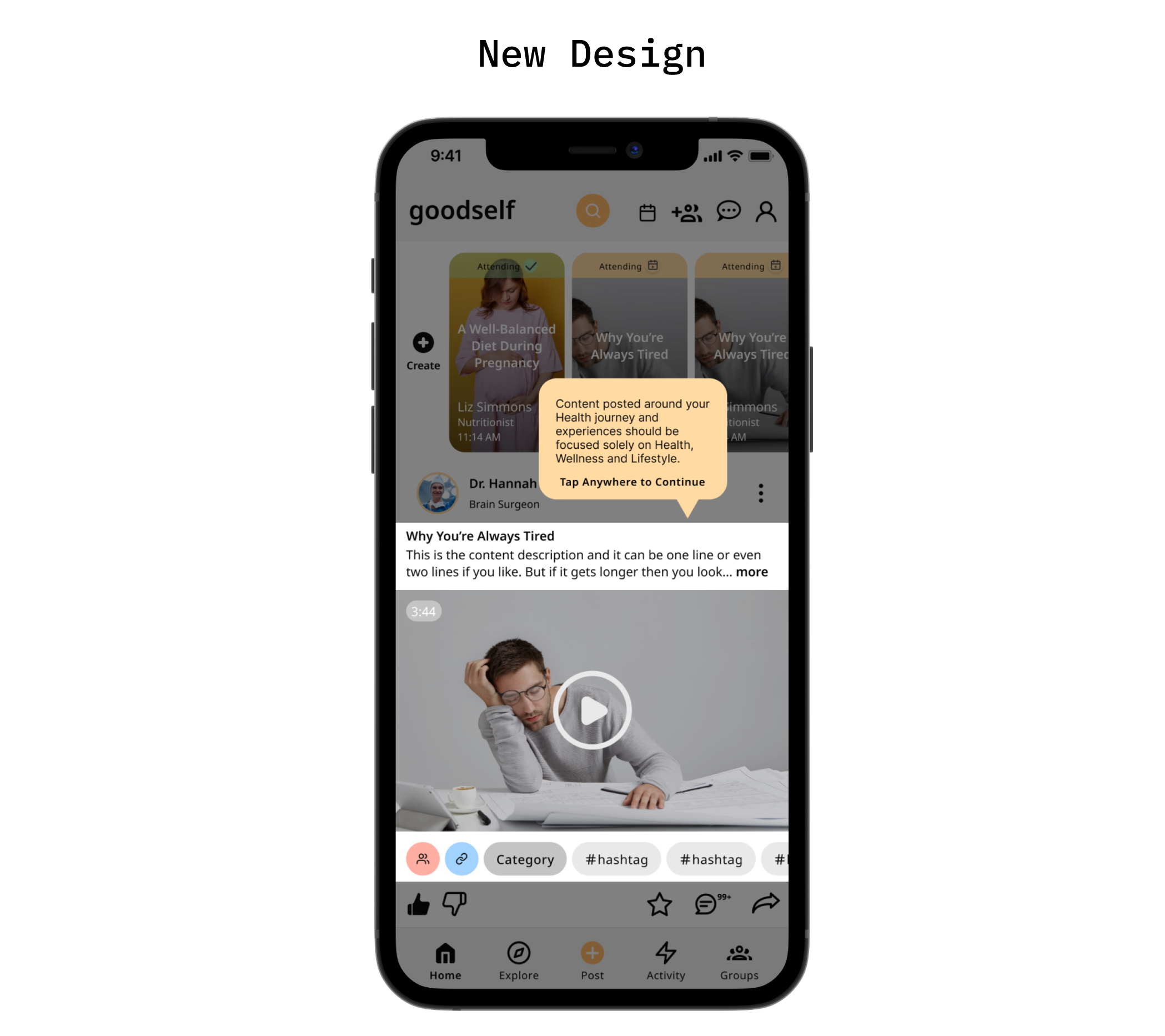
Our second proposal focused on improving engagement and clarity by recontextualizing content from the “Things to Know” page into tooltips. Recognizing user discomfort with extensive text blocks, we proposed delivering critical information in bite-sized pieces through tooltips.
This approach enhances engagement by making important content more accessible and encourages users to explore application features without overwhelming them with dense text.
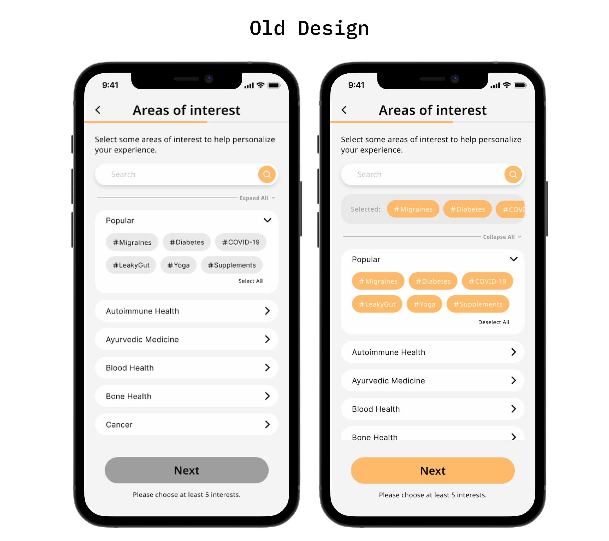
Proposal 3: Optimize Interests Page
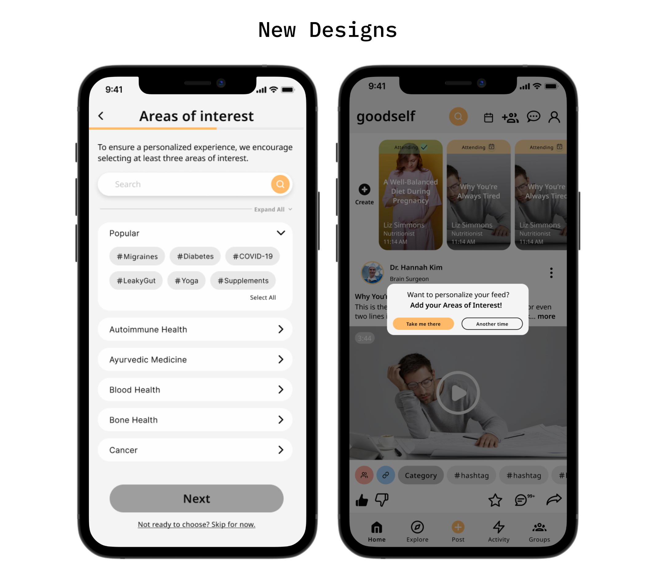
Our final proposal targets engagement by optimizing the interest selection process. Despite mixed user feedback, we advocated for integrating the choose-your-interests page into the initial sign-up process to personalize user experiences from the outset. We suggested reducing the mandatory interests to three and incorporating a skip button for flexibility.
A strategically worded skip button and subsequent reminders ensure users understand the importance of interest selection and encourage their participation, ultimately enhancing the overall user experience of the application.
Mockup
In order to help goodself visualize our proposals, we designed prototypes in Figma and created videos showcasing our improvements and presented them in a 10 minute pitch.
My Other Projects
CASE STUDY - BRANDING & LOGO DESIGN
93 Coffee
Partnering with 93 Coffee Cafe & Eatery in Vancouver was an exciting journey. Over a few months, I crafted their logo and visual identity, capturing the essence of their cozy cafe vibe. Additionally, I had the pleasure of photographing their delicious food and drinks, setting the stage for their online presence.
CASE STUDY - EXPERIENCE DESIGN STUDENT PROJECT
Formula E - ZONE
An onboarding experience that takes you on a thrilling journey through the racing mechanics and cutting-edge technologies that make Formula E the most electrifying racing series around.

